Brand
Design
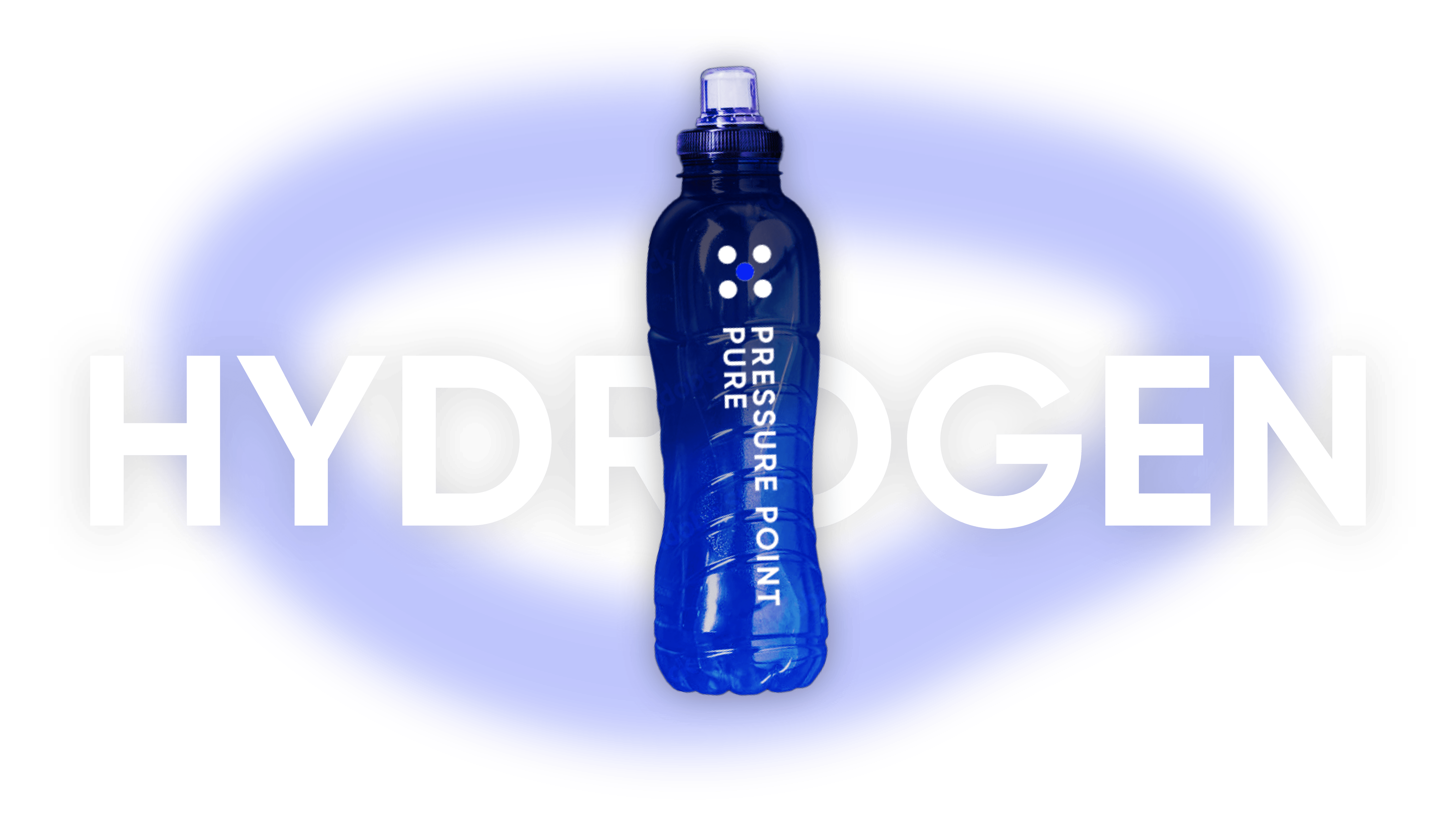
Packaging
Web
Pressure Point +
Pressure Point is a conceptual fitness brand. Starting with the logo, the brand explores the different ways the dot can be utilized. The dark color scheme beneath the blurred lines create an overall sense of energy for the brand. Along with that, the imagery utilizes cutouts and gradients that match the color scheme. The primary design tools were Adobe XD, Illustrator, and Photoshop.